THE NEWEST STUFF IS AT THE BOTTOM...PLEASE SCROLL DOWN
SORRY!
July 2012
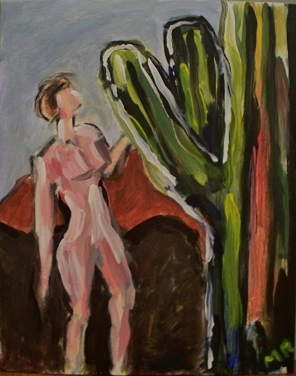
Cactus Lady 16"x20" Acrylic on canvas board
(Finished)
Aside from a couple holiday cards for my wife, this is the first thing I've painted in several years. I did it at a Colors & Bottles event (had a Living Social deal) at Green Door Tavern in Chicago.
The inspiration painting was a cactus on the left hand edge of the view. So I flipped it around & added a lady from some 1930s style ad from the bar. Minus her swim suit. No need to paint extra detail...
Its phallic nature is purely coincidental to the subject matter.
The inspiration painting was a cactus on the left hand edge of the view. So I flipped it around & added a lady from some 1930s style ad from the bar. Minus her swim suit. No need to paint extra detail...
Its phallic nature is purely coincidental to the subject matter.
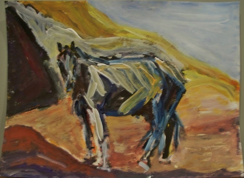
Lone Horse 1 9"x12" Acrylic & Gouache on paper
(Almost Done)
I'm trying to get back on the painting wagon. Based on my wife's reaction, this one's not quite done yet. Needs more brown on the horse, so she says.
I can't seem to take good pictures of my recent work. Duh - I should've scanned this one! Will post updates as I finish it and/or get better photos.
A lot of people seem not to like my scribbly, colorful style. Like a child's drawing. I'm not sure that's an insult, although clearly it's intended to be.
I love the Fauves & the Expressionists. I formed my style before I learned about them, but I feel like I'm in good company.

Lone Horse 1 9"x12" Acrylic & Gouache on paper
(Finished)
Just a few little changes, including the brown mentioned by my wife. I scanned it, so the image quality is much better, but it cut off the very bottom & washed out the blue sky.
August 2012
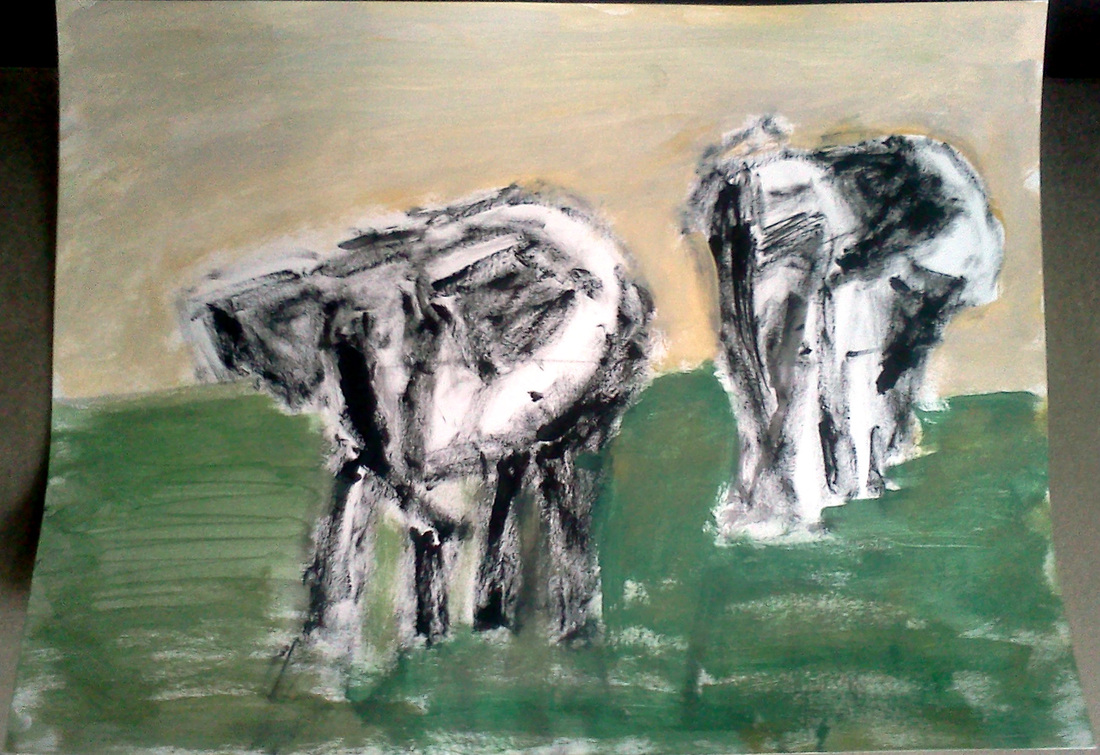
This is how a painting begins, in my world.
Elephant Pair in Shallow Water (just started)
9"x12" Acrylic & Gouache on paper
I used to paint alla prima about half the time. The other half of the time, I combine sketchy wet & dry brush strokes, to lead off the painting. I also like lots of contrast, so I'll probably work the dark areas dark-to-light & the light areas light-to-dark.
I took most of my good paints to the Michigan house, under the mistaken idea that I would do most of my renewed painting there. So now I'm stuck in Chicago working with a mish-mash of hobbyist quality gouache, some student grade & some professional grade acrylics.
I took most of my good paints to the Michigan house, under the mistaken idea that I would do most of my renewed painting there. So now I'm stuck in Chicago working with a mish-mash of hobbyist quality gouache, some student grade & some professional grade acrylics.

Elephant Pair in Shallow Water (still in process)
9"x12" Acrylic & Gouache on paper
I sort of think it's done, but will probably play with some small details & add some shadows in the water.
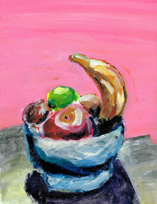
Tall Banana Still Life (Finished)
9"x12" Acrylic & Gouache on paper
This one has been 95% finished for 4 years. I dug it out & gloss-coated it. Good enough.
September 2012
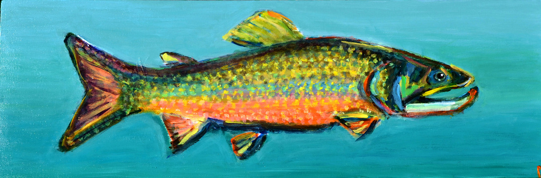
Brook Trout (Finished)
36"x12" Acrylic on Stretched Canvas
This fish painting will go above the microwave stand in the vacation house kitchen. I attempted to incorporate some color field style, building up 7 - 8 semi-transparent layers, including some 'interference' colors, to give it an inner shine. As is often said, it looks better in person.

Strange Bardot Painting (Finished)
9"x12" Acrylic on watercolor paper
I wanted to paint a female form and a young Brigitte Bardot in a swimsuit was, I figured, a safe place to start. Too bad she ended up more like Lily Munster, as painted by a collaboration of Leroy Neiman & Edvard Munch. My wife commented, "you should take some time to work on faces." LOL!

Not Done Yet!
Cheyenne Warriors 12"x16" Acrylic & Gouache on canvas board
(In Process)
This is the under painting for my version of this Edward Curtis photo of Cheyenne Warriors on their horses. I start with scribbles & keep adding layers until it becomes something.
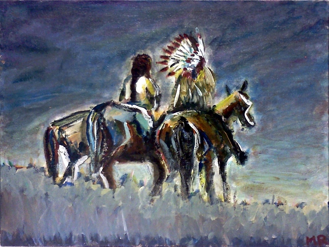
Finished!
Cheyenne Warriors 12"x16" Acrylic & Gouache on canvas board
(Finished)
NOTE: I will replace the above image with a better quality one soon.
I'm pretty happy with this painting. In my head, the title is now Ghost Riders 1.
The ground's not quite what I wanted. I tried to paint in some prairie grass, but it ended up looking clown-y & degraded the rest of the painting. So I got mad & killed it with some dark blue. Then I decided that I could better maintain the dignity of the central figures by de-emphasising the ground altogether. So the ground now looks like the sky, but with short, choppy vertical strokes, opposed to the sky's swirling strokes. I think it works. Very tempted to add a little earth or desert tone, though...
Click here at see short slide show of this painting.
And again, here is the source photo.
Just Started!
About 50% done
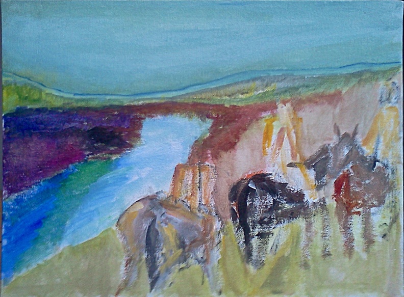
Piegan Blackfeet Along The Two Medicine River
12"x16" Acrylic & Gouache on canvas board
(In Process)
[Just Started]
Another one from an Edward Curtis photo. Hopefully you can see the place-holder spaces for the riders. If you compare with the photo, I squished the riders more (too much?) into the corner. I'm just going with it. I'm hoping this colorful underpainting sets the stage for a pretty end result.
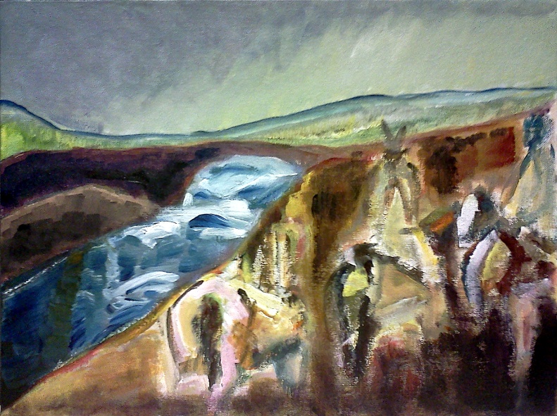
[About 50% done]
You can see that I've been playing with some heavier colors. Hopefully I can reign in my oscillation between light & dark to end up with both strong color & contrast. Most paintings go like this, where I like the start, then I mess it up, then it comes together in the end. Of course, this is all subjective. "I have no one but myself to please" -Maurice de Vlaminck
Another one from an Edward Curtis photo. Hopefully you can see the place-holder spaces for the riders. If you compare with the photo, I squished the riders more (too much?) into the corner. I'm just going with it. I'm hoping this colorful underpainting sets the stage for a pretty end result.
[About 50% done]
You can see that I've been playing with some heavier colors. Hopefully I can reign in my oscillation between light & dark to end up with both strong color & contrast. Most paintings go like this, where I like the start, then I mess it up, then it comes together in the end. Of course, this is all subjective. "I have no one but myself to please" -Maurice de Vlaminck
